-------------------------------------------------------------
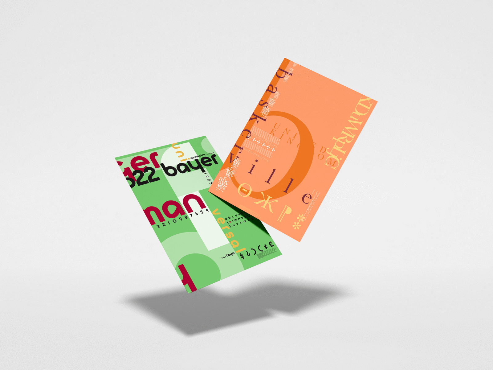
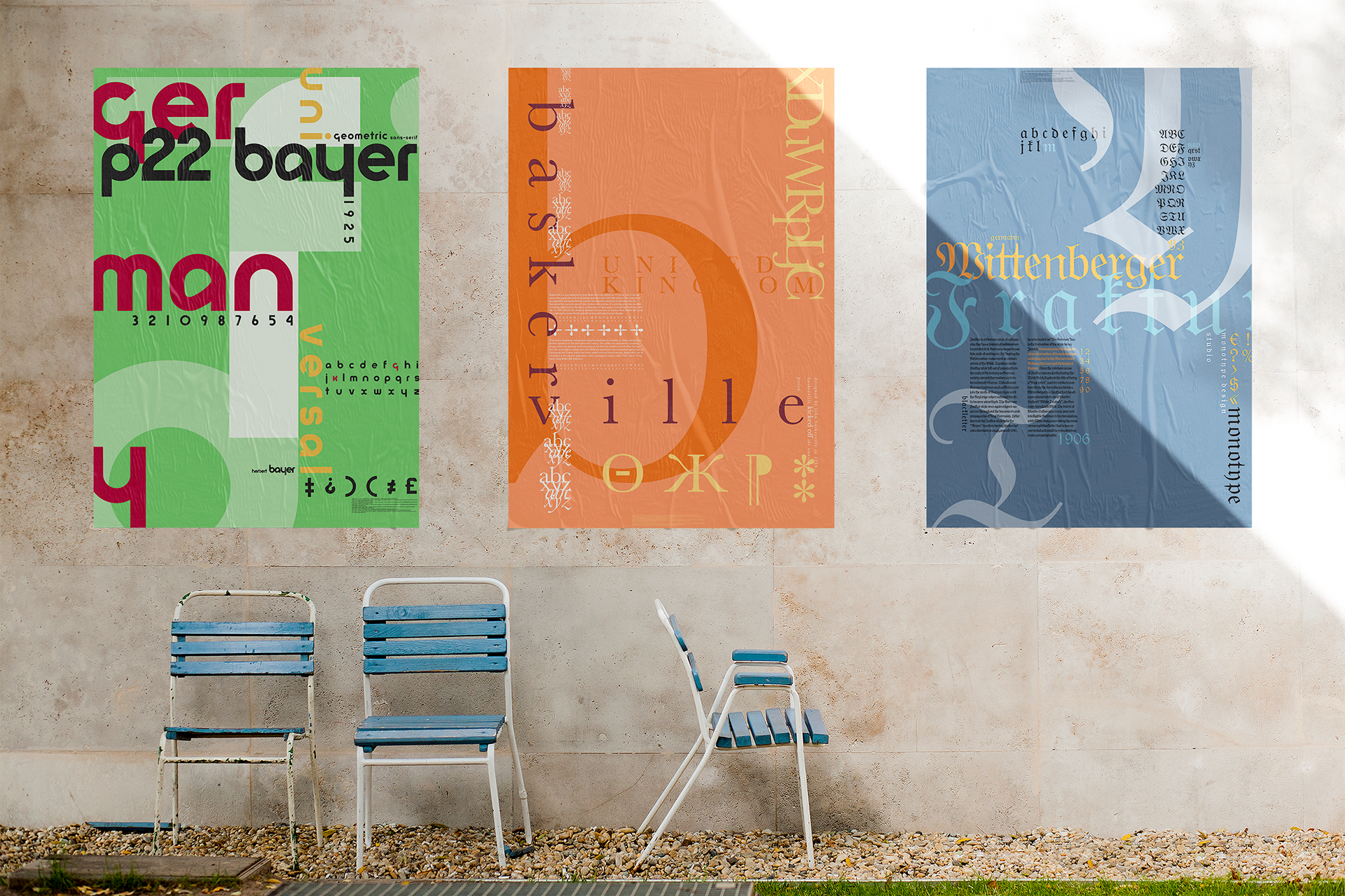
History of Type Poster Series
Typographic Poster
30" x 40"
2019
Large scale typographic posters designed to represent the historical relationship between three different typeface families: Baskerville, Wittenberger Fraktur, and Universal.
-------------------------------------------------------------
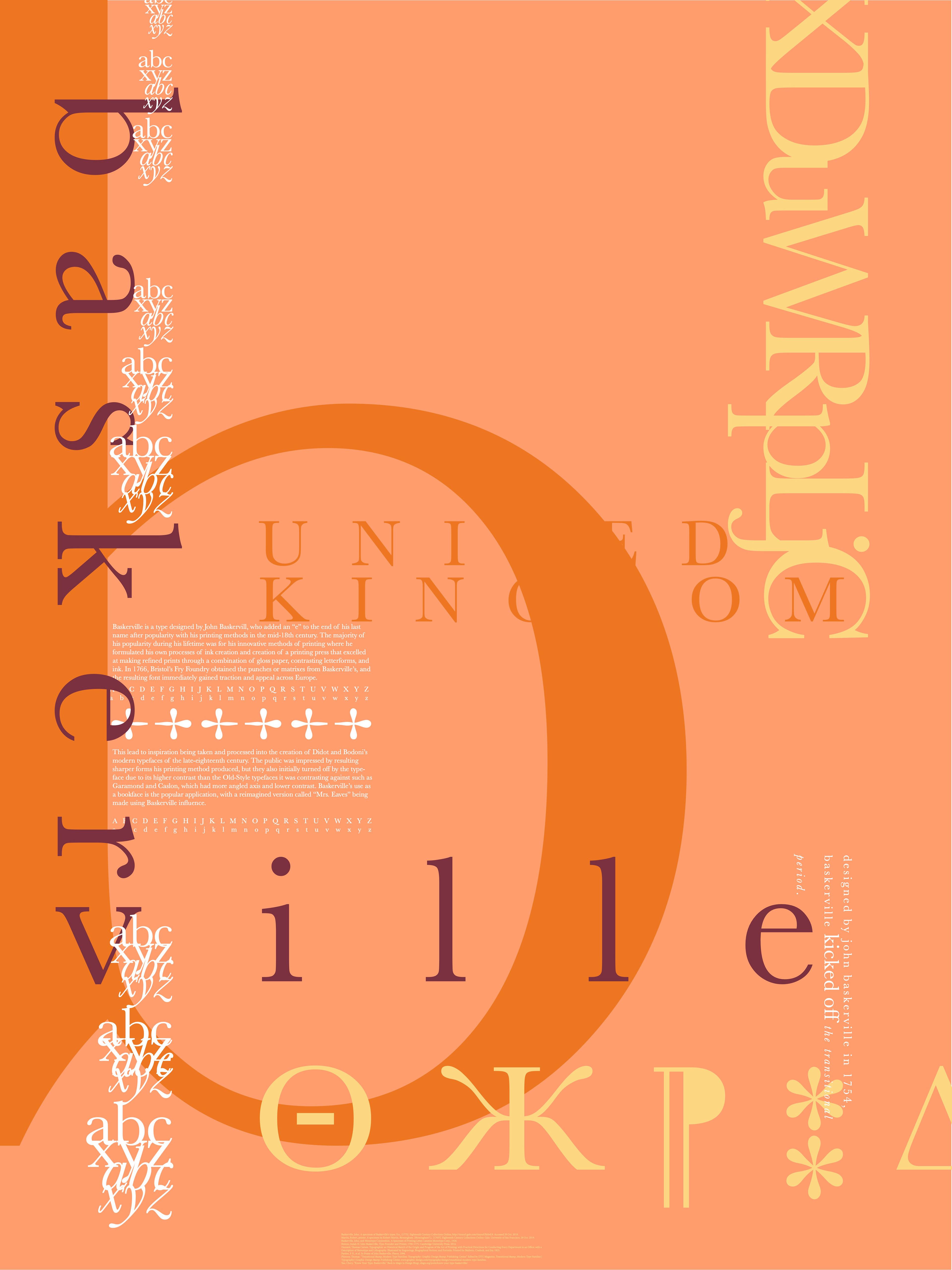

Baskerville, the Typeface
Typography Poster
30" x 40"
2019
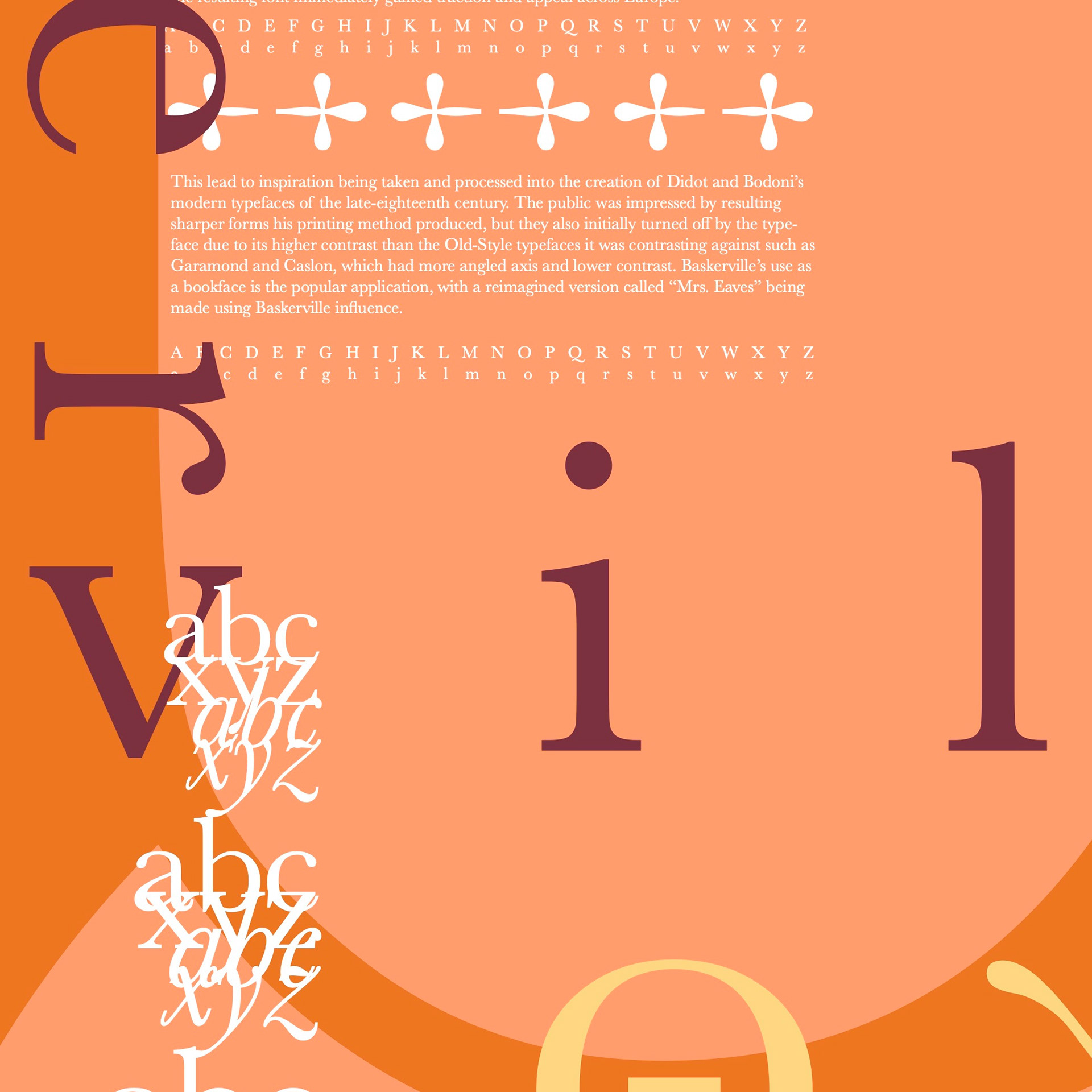
Baskerville is a type designed by John Baskervill, who added an “e” to the end of his last name after popularity with his printing methods in the mid-18th century. The majority of his popularity during his lifetime was for his innovative methods of printing where, due to other printers keeping their methods wrapped in secrecy, he formulated his own processes of ink creation and the creation of a printing press that excelled at making refined prints through a combination of gloss paper, contrasting letterforms, and ink. In 1766, Bristol’s Fry Foundry obtained the punches or matrixes from Baskerville’s, and the resulting font immediately gained traction and appeal across Europe. This lead to inspiration being taken and processed into the design of Didot and Bodoni’s modern typefaces of the late-18th century. The public was impressed by the resulting sharper forms his printing method produced, but they were also initially turned off by the typeface due to its higher contrast than the Old-Style typefaces it contrasted against such as Garamond and Caslon, which had more angled axis and lower contrast. Baskerville’s use as a bookface is the popular application, with a reimagined version called “Mrs. Eaves” being developed many years later.
-------------------------------------------------------------
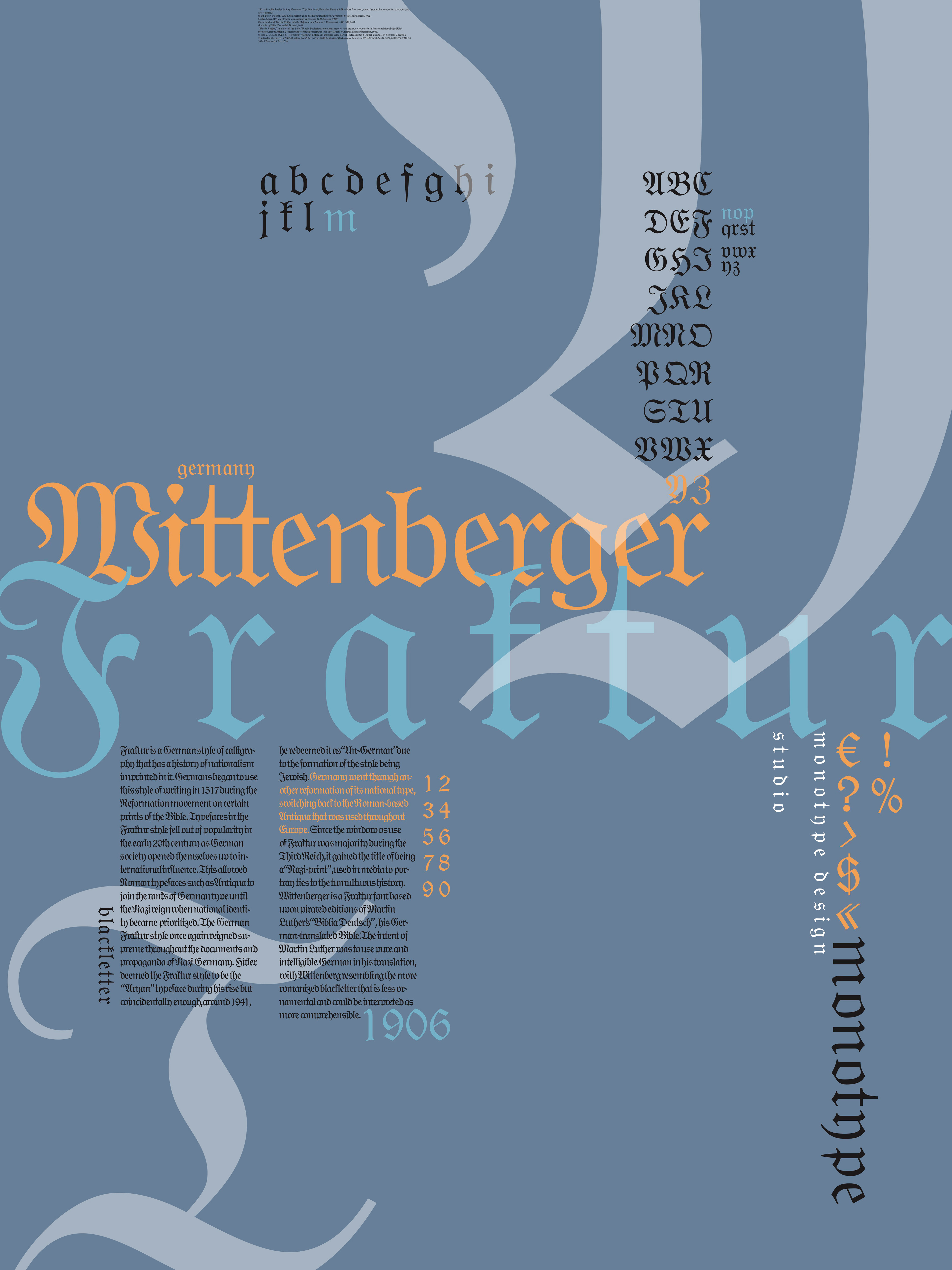


Wittenberger Fraktur, the Typeface
Typography Poster
30" x 40"
2019
Fraktur is a German style of calligraphy that has a history of nationalism imprinted in it. Germans began to use this style of writing in 1517 during the Reformation movement on certain prints of the Bible. Typefaces in the Fraktur style fell out of popularity in the early 20th century as German society opened themselves up to international influence. This allowed Roman typefaces such as Antiqua to join the ranks of German type until the Nazi reign when national identity became prioritized. The German Fraktur style once again reigned supreme throughout the documents and propaganda of Nazi Germany. Hitler deemed the Fraktur style to be the “Aryan” typeface during his rise but coincidentally enough, around 1941, he redeemed it as “Un-German” due to the formation of the style being Jewish. Germany went through another reformation of its national type, switching back to the Roman-based Antiqua that was used throughout Europe. Since the window os use of Fraktur was majority during the Third Reich, it gained the title of being a “Nazi-print”, used in media to portray ties to the tumultuous history. Wittenberger is a Fraktur font based upon pirated editions of Martin Luther’s “Biblia Deutsch”, his German-translated Bible. The intent of Martin Luther was to use pure and intelligible German in his translation, with Wittenberg resembling the more romanized blackletter that is less ornamental and could be interpreted as more comprehensible.
-------------------------------------------------------------
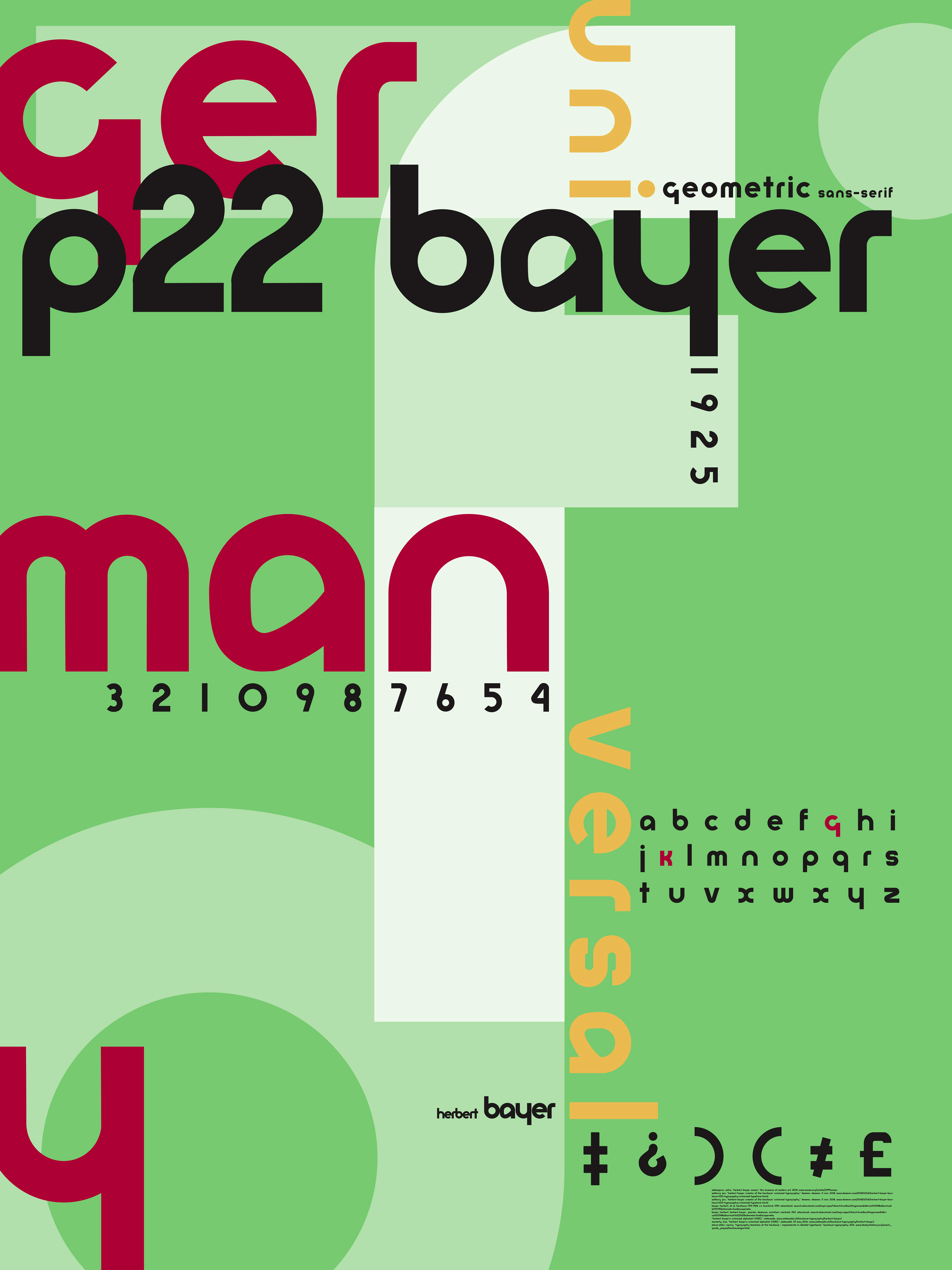


Universal, the Typeface
Typography Poster
30" x 40"
2019
With Herbert Bayer’s intent of making an accessible lower-case alphabet, I wanted to use the x-height to create forms that easily connect and make sense. The simplistic style of the figures are still detailed enough to create interesting shapes due to the universal styling and thickness. The color scheme of the Bauhaus designers always fell into utilizing the primary colors. Utilizing this styling feature in the poster will be an important tie to the historical significance of the font. In the references I was accumulating, I was able to see many different examples of work Bayer did that included typographic elements. He used very graphic colors with a simple white background to create very high contrast compositions. I intended to mimic the style of creating an interesting composition while maintaining an order throughout the design.
-------------------------------------------------------------